Phone:
(701)814-6992
Physical address:
6296 Donnelly Plaza
Ratkeville, Bahamas.
Phone:
(701)814-6992
Physical address:
6296 Donnelly Plaza
Ratkeville, Bahamas.
A fresh coat of paint can turn a bland bedroom into a retreat, or wreck it if the wrong choices are made. Beyond picking a soothing blue or trendy sage, there are techniques and strategies that add depth, personality, and visual interest without requiring advanced skills. From accent walls and two-tone treatments to textured finishes and painted patterns, the options extend well beyond rolling a single color onto four walls. This guide walks through practical painting ideas that work in real bedrooms, with attention to prep, materials, and execution. No fluff, just actionable strategies for transforming a bedroom on a DIY budget.
Color sets the mood, but it also interacts with light, furniture, and architecture in ways that aren’t obvious on a paint chip.
Start with undertones. Blues and greens with gray undertones feel calm and modern. Warm beiges, terracottas, and blush tones create coziness. Cooler grays can read sterile in north-facing rooms but sophisticated in spaces with ample natural light. Test samples on at least two walls, one that gets morning light and one that doesn’t, and view them at different times of day.
Consider the room’s size and ceiling height. Darker colors (charcoal, navy, deep olive) make large bedrooms feel intimate but can close in a small space unless balanced with bright trim and good lighting. Lighter neutrals (off-white, pale gray, soft linen) open up tight quarters but require higher-quality paint to avoid a flat, builder-grade look. Satin or eggshell sheens add subtle dimension without the maintenance headaches of flat paint in a lived-in room.
Match the palette to existing elements. If the flooring is warm oak, a cool gray may clash. If the bedding skews traditional, a stark white-and-black combo might feel jarring. Pull colors from textiles, art, or fixed elements like brick or tile. A bedroom with good bones can handle bold color: one with awkward angles or low ceilings benefits from a monochromatic or analogous scheme that minimizes visual breaks.
An accent wall draws the eye and adds contrast without the commitment of painting the entire room.
The headboard wall is the default choice for a reason. It’s the natural focal point and the first surface visible from the doorway. Deep, saturated colors, burgundy, forest green, charcoal, or rich navy, work well here. They ground the bed and make lighter bedding pop. Pair with the same color in a lighter tint on the remaining walls for a cohesive look, or contrast with a neutral.
Consider architectural features. A wall with a large window, built-in shelving, or a fireplace can handle an accent color or finish. Avoid painting a wall that’s cluttered with outlets, vents, or awkward door placements, accent walls work best when the architecture cooperates.
Try a different finish instead of a different color. High-gloss or satin paint on one wall, with matte on the others, creates subtle drama. Semi-gloss reflects light and works well behind a bed or dresser, especially in rooms with limited natural light. Just know that glossier finishes show wall imperfections, so proper prep, spackle, sand, prime, is non-negotiable.
Use painter’s tape carefully. For crisp lines where the accent wall meets adjacent walls, tape along the edge, paint the accent color, then remove the tape while the paint is still slightly tacky. Waiting until it’s fully dry often pulls off chips. A small angled brush helps cut in corners that tape can’t reach.
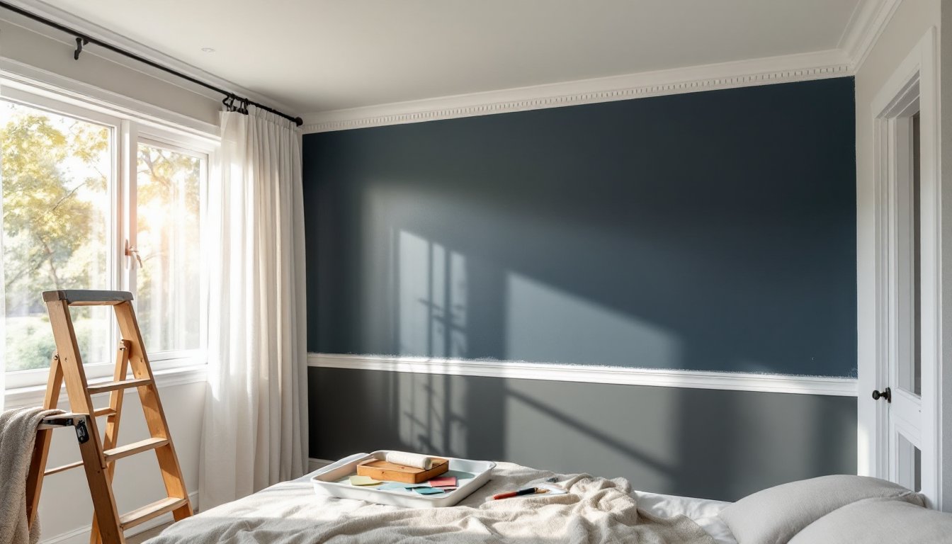
Splitting a wall into two colors adds architectural interest and can adjust perceived room proportions.
Horizontal splits are the most common approach. A darker color on the bottom third or half, with a lighter shade above, visually lowers the ceiling and adds weight, useful in tall, narrow bedrooms. The opposite (light below, dark above) can make a low ceiling feel even lower, so use it sparingly. The dividing line typically sits 32 to 48 inches from the floor, roughly chair-rail height. Mark the line with a laser level or chalk line, then apply painter’s tape on the edge that will stay clean.
Use a chair rail or picture molding as a natural divider. If the room already has trim at mid-wall height, paint above and below in contrasting tones. This works especially well in older homes with existing molding. If there’s no trim, consider adding inexpensive MDF or pine picture molding (available in 8-foot lengths at most home centers) to formalize the break. Paint it in the lighter of the two colors, or in semi-gloss white for contrast.
Color-blocking with geometric divisions offers a modern twist. Instead of a straight horizontal line, create a diagonal, a large painted rectangle, or an off-center vertical split. Use a level, measuring tape, and quality painter’s tape (FrogTape or similar low-bleed options work best). Apply a thin coat of the base color over the tape edge before applying the second color, this seals the tape and prevents bleed-through.
Prep is everything. Clean walls with a damp cloth and TSP substitute, fill holes, sand smooth, and prime any patched areas. Skipping these steps guarantees bleed, uneven coverage, and peeling tape.
Texture adds dimension that flat color can’t match, and it’s more forgiving of wall imperfections.
Venetian plaster creates a polished, stone-like finish with depth. It’s applied in thin layers with a trowel, burnished between coats. The learning curve is steep, practice on drywall scraps first. Kits are available, but hiring a professional for a single accent wall is often worth it if the budget allows. Expect to pay $8–$15 per square foot for labor, depending on region and finish complexity.
Limewash offers a matte, slightly mottled finish that’s trending in 2026. It’s breathable, eco-friendly, and softens over time. It works best on unsealed drywall, plaster, or brick, not over existing latex paint unless the surface is prepped with a bonding primer. Application is straightforward: dampen the wall, apply with a masonry brush in random X-strokes, then soften with a damp sponge. The finish develops over 24 to 48 hours as it cures.
Sponging, ragging, and color-washing are DIY-friendly techniques. Sponging (dabbing a natural sea sponge loaded with glaze over a base coat) adds subtle texture. Ragging (rolling or dabbing a bunched rag) creates irregular patterns. Color-washing (brushing a thinned topcoat in loose, overlapping strokes) mimics aged plaster. All three hide flaws and add visual interest without the cost of specialty products.
Chalkboard and magnetic paint turn a wall into a functional surface. Chalkboard paint requires at least two coats and a three-day cure before conditioning with chalk. Magnetic paint (actually magnetite primer) needs three to four coats to hold magnets reliably and works best under a topcoat of regular paint. Both are heavier than standard latex, so stir frequently during application.
Hand-painted patterns add custom flair without the cost or commitment of wallpaper.
Stripes are the most accessible. Vertical stripes make ceilings feel higher: horizontal stripes widen narrow rooms. Measure and mark with a level and painter’s tape, then paint alternating sections. For crisp lines, paint over the tape edges with the base color first, let it dry, then apply the stripe color. Peel the tape at a 45-degree angle while the topcoat is still wet.
Geometric shapes, triangles, hexagons, diamonds, require more planning but deliver high impact. Graph paper sketches help visualize scale and spacing. Use a laser level and measuring tape to transfer the design to the wall, then tape off sections. A small foam roller covers large shapes faster than a brush and minimizes streaks. Metallic or matte-black shapes on a neutral base create a sophisticated, modern look.
Stencils simplify complex designs like damask, Moroccan tiles, or botanical motifs. Secure the stencil with repositionable spray adhesive, then apply paint with a foam pouncer or dense foam roller, less paint is more. Overloading causes bleed. Work in small sections, clean the stencil frequently, and use a level to keep rows straight. Cutting Edge Stencils and Royal Design Studio offer durable, reusable options in a range of styles.
Murals and freehand designs require confidence or a projector. Sketch the design on paper, then use a grid method or digital projector to scale it onto the wall. Acrylic craft paint works for fine details, but use interior latex for large areas to ensure durability and color consistency. Seal finished murals with a clear matte or satin topcoat.
Ombré or gradient walls blend colors from dark to light. Start with the darkest shade at the bottom, the lightest at the top, and mix custom mid-tones for the transition zones. Blend with a dry brush or blending tool while the paint is wet. This technique demands speed and a helper, it’s tough to keep a wet edge solo.
Ceilings and trim are often afterthoughts, but they’re key to a polished finish.
Painting the ceiling a color other than white adds unexpected character. A shade slightly lighter than the walls creates a cocooning effect. A bold, dark ceiling (charcoal, deep blue, or black) works in rooms with high ceilings and good light but can feel heavy in small, dim spaces. Semi-gloss or satin finishes reflect more light than flat, but they also highlight imperfections, skim-coat and sand any flaws first.
Contrast trim with the wall color for definition. Bright white trim (semi-gloss or satin) crisps up any wall color and highlights molding details. Off-white or cream trim softens the look and works well with warm wall tones. Painting trim the same color as the walls, in a higher sheen, creates a seamless, modern effect, especially effective in small bedrooms where too much contrast chops up the space.
Don’t skip primer on trim, especially if painting over stained wood or dark colors. An oil-based or shellac-based primer (like BIN or Cover Stain) blocks tannins and stains that bleed through latex. Sand lightly between coats for a smooth finish. Use a high-quality angled brush for cutting in and a small foam roller for flat surfaces like baseboards and door casings.
Edge work separates amateur jobs from pro-looking results. Invest in a good 2.5-inch angled sash brush. Load the brush lightly, wipe excess on the rim, and use steady, confident strokes. Tape helps, but a steady hand and practice often yield cleaner lines. If using tape, remove it slowly at an angle before the paint fully dries to avoid peeling.
Bedroom painting projects range from straightforward refreshes to ambitious custom finishes, but all share common ground: proper prep, quality materials, and attention to detail. Whether adding an accent wall, experimenting with two-tone techniques, or tackling a hand-painted pattern, the difference between a DIY success and a redo often comes down to patience and planning. Start with a clear vision, test colors in real light, and don’t rush the tape-and-prime steps. The result is a bedroom that feels intentional, personal, and worth the effort.