Phone:
(701)814-6992
Physical address:
6296 Donnelly Plaza
Ratkeville, Bahamas.
Phone:
(701)814-6992
Physical address:
6296 Donnelly Plaza
Ratkeville, Bahamas.
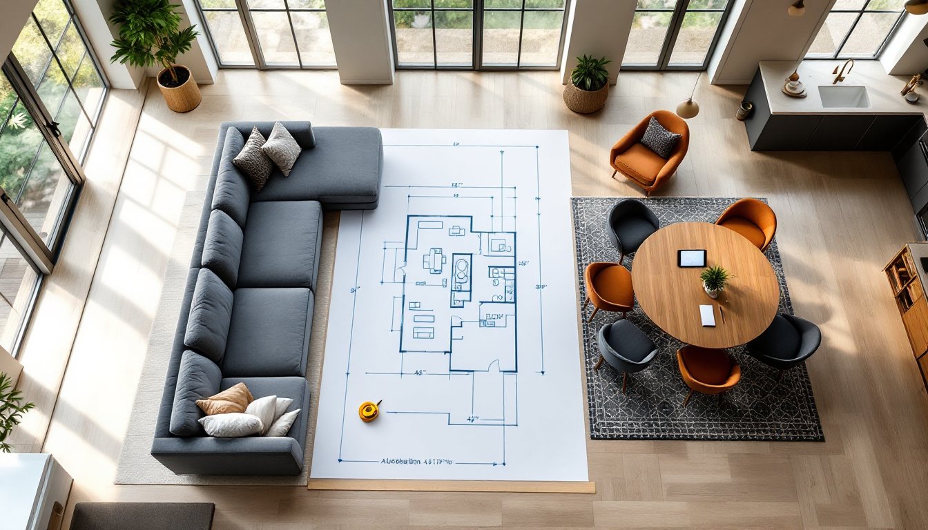
A room can have beautiful finishes, expensive furniture, and perfect paint colors, but if the layout doesn’t work, the space fails. That’s where space planning comes in. It’s the foundational step in interior design that determines how a room functions, how people move through it, and whether it actually serves the purpose it’s meant to. Unlike decorating, which focuses on aesthetics, space planning deals with the bones of a room: furniture placement, traffic patterns, clearances, and zones. Contractors understand framing and load paths: space planning applies similar logic to livability. Done right, it turns awkward, underused rooms into spaces that feel intuitive and comfortable. Done wrong, it creates bottlenecks, wasted square footage, and furniture that never quite fits.
Space planning is the process of analyzing how a room will be used and organizing its layout to support those activities. It accounts for furniture dimensions, circulation paths, clearances, and how different zones within a room relate to one another. Think of it as the floor plan stage, before paint, before trim, before anything decorative.
This step matters because it directly affects usability. A living room with a sofa blocking the main walkway isn’t just inconvenient, it disrupts flow and makes the space feel smaller. A kitchen island placed 30 inches from the counter creates a squeeze point that slows down cooking and increases the chance of collisions. These aren’t style problems: they’re planning problems.
Space planning also maximizes square footage. Many homeowners assume they need more space when the real issue is poor layout. A 10×12 bedroom can feel cramped or spacious depending on bed placement, door swing, and furniture scale. Professionals use space planning to identify wasted areas, like corners that collect clutter or walls that could support built-ins, and turn them into functional zones.
In renovation and new construction projects, space planning happens early. It informs decisions about door locations, window placement, and even electrical outlet positioning. Skipping this step often leads to costly fixes later, like relocating switches or resizing openings because the furniture layout wasn’t considered upfront.
Good space planning relies on a few foundational principles that apply across room types and design styles. These aren’t subjective, they’re based on ergonomics, building standards, and how people actually use spaces.
Traffic flow refers to the paths people take when moving through a room. Primary circulation routes, like the path from the front door to the kitchen or from the hallway to the bedroom, should remain clear and direct. Furniture shouldn’t force detours or create dead ends.
Most design guidelines recommend a minimum of 36 inches for main walkways. In high-traffic areas like hallways or spaces between a kitchen island and counters, 42 to 48 inches is better, especially in homes with mobility devices or multiple occupants. Secondary paths, like the route around a coffee table, can be narrower, but 18 to 24 inches is the functional minimum.
Doorways also dictate flow. A door that swings into a room needs clearance: furniture placed too close creates awkward navigation. Consider the door’s arc when laying out a bedroom or bathroom. In open floor plans, circulation paths should connect activity zones without cutting through them. For example, the route from the entryway to the back door shouldn’t bisect the main seating area in a living room.
A well-planned room serves its intended use while still looking cohesive. That means understanding the primary function, sleeping, cooking, working, gathering, and designing around it. A home office needs desk space, task lighting, and storage within arm’s reach. A dining room needs enough clearance for chairs to pull out (24 to 30 inches from table edge to wall or furniture).
Zoning helps organize multi-use spaces. In an open-concept living area, rugs, furniture arrangement, and lighting can define separate zones for lounging, dining, and cooking without physical walls. Each zone should feel distinct but visually connected.
Proportions matter, too. Oversized furniture in a small room overwhelms the space: undersized pieces in a large room look lost. A sectional sofa might work in a 15×20 great room but dominate a 12×14 living room. Measure furniture dimensions and sketch layouts to scale, graph paper works, but digital tools like graph apps or CAD software make iteration easier.
Balance also means leaving breathing room. Not every wall needs furniture against it. Empty space, sometimes called negative space, gives the eye a place to rest and prevents a room from feeling cluttered.
Space planning isn’t guesswork. It follows a process that starts with accurate measurements and ends with a functional layout.
For renovations, this process also highlights where walls, doorways, or windows might need relocation, before demolition starts. Catching those changes early avoids expensive change orders.
Even experienced DIYers make predictable errors. Here’s what to watch for:
Many of these mistakes stem from skipping the planning phase and arranging furniture by trial and error. Measuring and sketching first saves time, money, and sore backs from moving heavy pieces multiple times.
Different rooms have different needs. A kitchen layout doesn’t follow the same rules as a bedroom.
Living rooms center on seating and conversation. The main seating area, sofa, chairs, coffee table, should form a rough circle or square, with seats no more than 8 to 10 feet apart for comfortable conversation. TV viewing distance depends on screen size, but a general rule is 1.5 to 2.5 times the diagonal screen measurement. In open layouts, use rugs or furniture arrangement to separate the living zone from adjacent spaces.
Bedrooms prioritize the bed, which typically goes on the wall opposite the door or the longest wall. Leave at least 24 inches on either side for access and making the bed. Dressers and nightstands should be easy to reach without navigating an obstacle course. Closet doors need clearance to open fully, at least 36 inches for a standard hinged door, less for sliders or bifolds.
Kitchens follow the work triangle concept, the path between the sink, stove, and refrigerator should total 12 to 26 feet, with no single leg longer than 9 feet. Modern kitchens often use work zones instead, grouping prep, cooking, and cleanup areas. Islands need 42 to 48 inches of clearance on all sides for traffic and cabinet access. Base cabinets are typically 24 inches deep: uppers are 12 inches. Plan around those dimensions.
Home offices need task-specific layouts. A desk should have access to natural light without glare on the screen. Allow 24 to 30 inches of depth for a work surface and 36 inches of width per person. File cabinets, printers, and storage should be within arm’s reach or a short roll in an office chair.
Bathrooms are tightly regulated by code. Toilets generally need 15 inches of clearance from the center to any side wall and 21 inches in front. Vanities are 30 to 36 inches tall: allow 21 inches of standing space in front. Shower sizes vary, but 36×36 inches is a common minimum for a prefab unit.
Each room type has its own set of standards, but the underlying logic stays the same: measure, plan, and prioritize how the space will actually be used.