Phone:
(701)814-6992
Physical address:
6296 Donnelly Plaza
Ratkeville, Bahamas.
Phone:
(701)814-6992
Physical address:
6296 Donnelly Plaza
Ratkeville, Bahamas.
A single-color deck works fine, but a two tone approach adds depth, visual interest, and definition that makes an outdoor space feel intentional. Splitting a deck into complementary colors can highlight architectural features, separate functional zones, or simply break up monotony on larger platforms. The strategy isn’t new, deck builders and painters have used contrasting rail and floor colors for decades, but modern exterior stains and paints have expanded the palette beyond standard browns and grays. Whether homeowners want subtle elegance or a striking modern look, two tone deck painting offers flexibility without requiring structural changes or a full rebuild.
Two tone deck designs solve several practical and aesthetic problems. Contrast between surfaces makes transitions safer and more visible, especially helpful on multi-level decks or where stairs meet the main platform. Dark railings against lighter decking create clear boundaries that prevent accidental missteps.
From a design standpoint, two colors let homeowners tie the deck to the home’s existing palette. A gray deck floor can echo siding or trim, while white railings match window frames. This visual connection makes the deck feel like an extension of the house rather than an afterthought.
Two tone painting also camouflages wear patterns. High-traffic areas and horizontal surfaces fade faster than vertical ones. Using a darker, more forgiving color on deck boards and a lighter shade on railings keeps the space looking fresh longer. Repainting just the floor in five years is simpler than tackling the whole structure.
Finally, color zoning works on larger decks. A seating area painted in one tone and a dining zone in another creates visual separation without physical barriers. It’s a budget-friendly alternative to built-in planters or privacy screens.
Gray decking paired with white railings remains the most popular two tone choice for good reason. Medium to charcoal gray hides dirt, pollen, and UV fading while providing neutral ground for furniture and planters. White or off-white railings brighten the perimeter and reflect light into shaded areas under roof overhangs.
This combination works across architectural styles, from coastal cottages to suburban colonials. For a cooler look, stick with true grays that have blue undertones. Warmer grays with beige or taupe notes soften the contrast and pair well with brick or natural wood siding.
One consideration: white railings require more frequent touch-ups. Exterior acrylic latex paint in a satin or semi-gloss sheen resists mildew and cleans easier than flat finishes. Plan to wash white rails annually and repaint every 3-4 years depending on sun exposure.
For homeowners who prefer earth tones, rich brown deck boards with beige or tan railings create a warm, grounded palette. This approach mimics natural wood tones without the maintenance of bare lumber, and it blends seamlessly with wooded lots or rustic home exteriors.
Solid stains in chocolate or espresso shades offer durability and UV protection while maintaining some texture visibility. Beige railings in a complementary undertone, whether peachy tan or gray-beige, add contrast without the starkness of white.
Brown and beige combinations also age gracefully. Minor scuffs and weathering blend into the color rather than standing out. This makes the pairing ideal for decks with pets, kids, or heavy outdoor furniture use. Apply a premium solid stain rated for horizontal surfaces to deck boards, reserving semi-transparent or solid stain in lighter shades for vertical rail components.
Homeowners ready to push beyond neutrals have several striking options. Navy blue deck boards with white railings deliver a nautical-inspired look that works particularly well near water or on coastal properties. Navy hides stains and fading while providing enough contrast to make white pop.
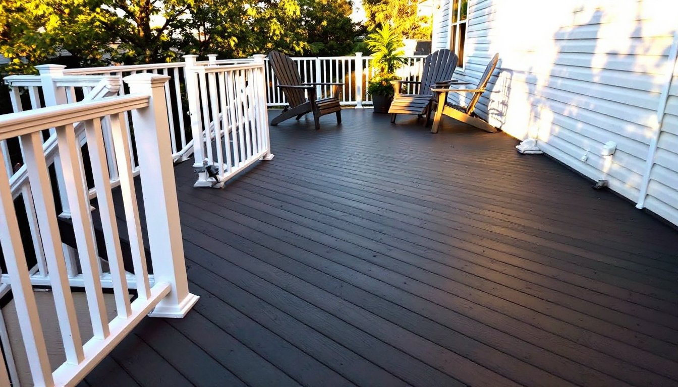
Charcoal or black decking with natural wood-toned railings creates an upscale, contemporary aesthetic. The dark floor anchors the space and makes greenery and outdoor furniture stand out. Natural cedar or redwood-toned stain on railings adds warmth and prevents the deck from feeling too industrial. This combination requires quality surface prep, any missed spots or drips show clearly on dark finishes.
Another modern approach: slate gray decking with sage green or muted teal railings. These muted jewel tones tie into nature without looking overly rustic. The key is keeping one color neutral (gray) and introducing color through railings, which are easier to repaint if tastes change.
When working with bold colors, test samples on scrap lumber first. Exterior paint and stain dry darker than they appear wet, and full sun versus shade drastically changes how colors read. Leave test boards outside for a week before committing to full coverage.
Two tone decks don’t require limiting colors to floors and railings. Alternating deck board colors in a striped pattern adds movement and visual interest to large, flat surfaces. This works best with similar tonal values, like light gray and medium gray, to avoid a busy, disorienting effect.
For a more defined look, paint the perimeter boards in a contrasting color to frame the main deck surface. A two-board border in a darker or lighter shade than the field creates a finished, intentional appearance similar to a picture frame. This technique also helps define deck edges for safety.
Stair and step contrast is both practical and attractive. Painting stair risers in one color and treads in another improves visibility and reduces trip hazards. Dark risers with light treads tend to show depth better than the reverse. For added safety, consider a textured additive in the tread paint to improve traction in wet conditions.
Another option: diagonal or checkerboard patterns. These require precise measuring and taping but create custom looks without complex carpentry. Use painter’s tape rated for exterior use and remove it while the top coat is still slightly tacky to prevent peeling. A small foam roller works better than a brush for crisp pattern edges.
Color-blocking different functional zones, like painting a built-in bench or planter box in an accent color, adds dimension without overwhelming the space. Keep accent colors to 20% or less of the total deck surface to maintain balance.
Start by evaluating the home’s existing exterior colors. Pull paint chips or photograph siding, trim, shutters, and roofing. The deck should complement at least one of these elements. If the house is brick, echo the mortar color or pick up red undertones. For vinyl siding, match or contrast with trim colors.
Consider the deck’s exposure. South and west-facing decks receive intense sun, which fades colors faster and makes dark shades absorb heat. Lighter tones or reflective paints help keep surface temperatures manageable for bare feet. North-facing or shaded decks can handle darker colors without excessive heat buildup.
Test colors in context. Paint or stain sample boards (at least 12 x 12 inches) and place them on the existing deck at different times of day. Morning light, midday sun, and evening shade all shift color perception. Live with samples for several days before deciding.
Think about maintenance willingness. Light colors show dirt, pollen, and mildew more readily but keep surfaces cooler. Dark colors hide grime but require heat-resistant formulations and may need more frequent recoating due to UV breakdown.
Finally, check HOA guidelines or local covenants if applicable. Some communities restrict exterior color palettes or require approval for changes visible from the street. Confirm compliance before purchasing paint or beginning prep work to avoid costly do-overs.