Phone:
(701)814-6992
Physical address:
6296 Donnelly Plaza
Ratkeville, Bahamas.
Phone:
(701)814-6992
Physical address:
6296 Donnelly Plaza
Ratkeville, Bahamas.
Choosing the right paint for a living room goes beyond picking a pretty color. It’s about setting tone, managing light, and making architectural decisions that affect how the entire home feels. Whether the goal is adding drama with a moody accent wall or opening up a cramped space with strategic color placement, paint remains the most cost-effective transformation tool in any DIYer’s arsenal. This guide covers trending palettes, creative techniques, and practical placement strategies that work in real homes, not just staged photo shoots.
Warm neutrals continue dominating 2026 palettes, but they’ve shifted away from builder-grade beige. Think greige (gray-beige hybrids) like Sherwin-Williams Accessible Beige or Benjamin Moore Revere Pewter. These colors read warm in natural light but don’t skew yellow under LED bulbs.
Earthy terracottas and clay tones bring warmth without the orange overload of past decades. Colors like Behr’s Rustic Adobe or Benjamin Moore’s Firenze work particularly well in living rooms with abundant natural light. They pair cleanly with white trim and natural wood accents.
For those leaning cooler, soft sage greens and muted blues offer calming alternatives. Farrow & Ball’s Pigeon or Benjamin Moore’s Palladian Blue create depth without feeling cold. These shades work especially well in south-facing rooms where sunlight can make warmer colors feel overwhelming.
Deep, saturated jewel tones, emerald, navy, charcoal, remain popular for accent walls or entire rooms when paired with adequate lighting. These require confidence and commitment: test samples in different lighting conditions before buying five gallons. Natural light exposure dramatically affects how saturated colors read throughout the day.
Color blocking divides walls into geometric sections using painter’s tape and multiple colors. The key is planning proportions before taping, sketch it out or use painter’s tape to mock up the design first. Use a level and measuring tape to keep lines true: eyeballing rarely works. Apply base coat first, let it cure 24 hours, then tape and apply contrasting colors. Remove tape while the top coat is still slightly tacky to prevent peeling.
Ombré or gradient effects transition one color into another, typically from darker at the bottom to lighter at the top. This requires blending wet paint, so work in small sections with a partner. Use a large dry brush or sea sponge to blend where colors meet. Practice on drywall scraps first, this technique has a learning curve.
Horizontal or vertical stripes add visual interest and can manipulate perceived room dimensions. Vertical stripes make ceilings feel higher: horizontal stripes widen narrow rooms. Width matters: 6–12-inch stripes feel modern: narrower stripes can read busy. Use low-tack painter’s tape (3M ScotchBlue Delicate Surface is reliable) and a small foam roller for crisp edges.
Stenciling offers pattern without wallpaper commitment. Secure stencils with repositionable spray adhesive, use a stencil brush or dense foam roller, and apply thin coats to prevent bleed-under. Moorish tiles, geometric patterns, or botanical motifs work well at fireplace surrounds or behind shelving.
The best accent wall is the one that draws the eye naturally when entering the room. Typically, that’s the wall behind the sofa, the fireplace wall, or the wall opposite the main entrance. Avoid placing accent walls on short walls in narrow rooms, it can make the space feel more cramped.
Fireplace walls are classic candidates, especially if there’s architectural detail like built-ins or stone. A deep color here anchors the room without overwhelming it. Navy, forest green, or charcoal work well, particularly when the fireplace surround is white or light stone.
The wall behind the TV or media console benefits from darker tones that reduce glare and help screens visually recede. Matte or eggshell finishes are preferable here, satin and semi-gloss can create reflective hotspots under artificial lighting.
For open-concept spaces, use the accent wall to define the living zone without adding physical barriers. A bold color on the sofa wall signals the conversation area, separating it visually from the dining or kitchen space.
Avoid accent walls in rooms with too many windows or doors, broken-up wall space dilutes the effect. And skip accent walls entirely if architectural features (coffered ceilings, wainscoting, bold trim) already create visual interest.
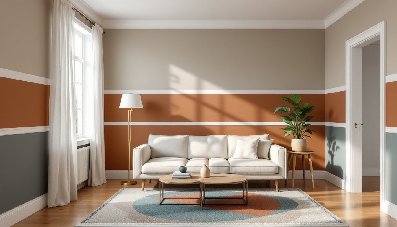
Horizontal splits (also called picture rail treatments) divide the wall into upper and lower sections. The traditional break point is one-third up from the floor, roughly 32–36 inches in a standard 8-foot room. Paint the lower section darker to ground the room: lighter on top keeps ceilings from feeling low. This approach works especially well in rooms with chair rail molding already in place.
Use a 4-foot level and chalk line to mark the division line. Paint the lower section first, let it dry completely, then tape along the line and paint the upper portion. Peel tape at a 45-degree angle while paint is slightly tacky.
Vertical splits work in asymmetrical rooms or spaces with distinct functional zones. Painting one end of a long living room a different color can create a cozy reading nook or workspace without adding walls. Keep colors within the same tonal family to avoid a jarring effect.
Ceiling and wall color continuation is gaining traction, painting the ceiling and one wall the same bold color while keeping remaining walls neutral. This works particularly well with deep greens, blues, or warm terracottas. It wraps the room in color without the cave effect of painting everything dark.
Always sample two-tone combinations on poster board before committing. Colors interact: what looks balanced in paint chips can feel off in application.
Flat (matte) finish hides surface imperfections better than any other sheen, making it ideal for older homes with textured or patched drywall. It diffuses light beautifully but marks easily and doesn’t clean well. Reserve flat paint for low-traffic living rooms or ceilings.
Eggshell finish offers a slight sheen (5–10% gloss) and better washability than flat while still minimizing wall flaws. It’s the workhorse finish for most living rooms, durable enough for family use, forgiving enough for imperfect walls. Most major brands’ eggshell formulas now include stain-blocking technology.
Satin finish (25–35% gloss) stands up to cleaning and light scrubbing, making it suitable for homes with kids or pets. The trade-off: it highlights wall imperfections and can create sheen variations if touch-ups are needed later. Satin works well on smooth, well-prepped drywall.
Semi-gloss and gloss finishes are generally too reflective for living room walls but work beautifully on trim, doors, and built-ins to create contrast against matte or eggshell walls.
For two-tone applications, keeping finishes consistent across colors usually looks cleanest. Mixing finishes (matte on top, satin below) can work but requires careful execution at the transition line.
Light, cool colors recede visually, making walls feel farther away. Soft grays, pale blues, and muted greens open up tight spaces better than warm tones. But don’t default to stark white, it can feel sterile and actually emphasizes small dimensions.
Painting trim and walls the same color (or very close values) eliminates visual breaks that chop up space. This monochromatic approach lets the eye travel uninterrupted, making rooms feel more expansive. Use different finishes to maintain subtle definition: eggshell on walls, semi-gloss on trim.
Painting the ceiling a shade lighter than walls (or continuing wall color onto the ceiling) prevents the lid-on-a-box effect. In very small rooms, painting the ceiling the same color as walls can actually blur boundaries and add airiness.
Avoiding dark accent walls in small spaces is common advice, but it’s not absolute. A dark wall can add drama and depth if it’s the farthest wall from the entry and flanked by lighter walls. Just don’t paint the short wall in a narrow room dark, it’ll feel like it’s closing in.
Reflective finishes catch light and expand perceived space slightly, but overusing satin or semi-gloss on walls can create glare. Stick with eggshell and use higher sheen sparingly on architectural details you want to emphasize.
The right paint transforms a living room from generic to intentional. Whether the approach involves a single bold accent wall, a carefully balanced two-tone scheme, or an experimental technique like ombré, success comes down to proper prep, realistic color sampling, and choosing finishes suited to the room’s use and condition. Test colors in actual lighting conditions, invest in quality painter’s tape, and don’t skip primer, especially when going darker. The best living room paint job is one that looks deliberate, not default.